
Your customer sees the outer fabric first. But the moment they put on the garment, or open it to check the interior, the lining is what they feel and judge. A well-matched lining colour signals that you have thought through every detail.
A mismatched or poorly chosen lining colour undermines even the best outer fabric and tailoring work.
If you are producing sherwanis, suits, blazers or bandhgalas at scale, lining colour is a production decision that deserves the same attention as outer fabric selection. This blog gives you a practical, garment-by-garment guide to matching your polyester lining colour correctly, and what to keep in stock to cover your full range.
Table of Contents
- Why Lining Colour Matters More Than You Think
- The Four Lining Types and How Colour Reads in Each
- Colour Matching by Garment — Sherwanis, Suits and Blazers
- The Colours Your Production Should Always Have in Stock
- Common Colour Mistakes and How to Avoid Them
- Building Your Colour Stock Before the Next Season
Why Lining Colour Matters More Than You Think
In garment manufacturing, lining colour is often treated as an afterthought, something decided at the end of the process, sometimes based on whatever is available rather than what is right for the garment. That approach shows up in the finished piece.
Your lining does three things simultaneously. It hides your interior construction, the interlining, chest pieces, seam allowances and stitching work that should never be visible to the buyer. It makes your garment easier to wear, the smooth surface of a well-chosen polyester lining fabric reduces friction so the garment slides on and off without catching. And it signals the quality of your work, when your customer opens a suit jacket or sherwani and sees a clean, well-matched lining in a quality finish, it tells them you paid attention to every part of the garment, not just the outside.
The colour decision connects all three. A lining that is too light under a dark outer fabric can show through at stress points, armholes, side seams, the front opening, and makes the interior look cheap regardless of the lining’s actual quality. A lining that clashes with the outer colour tells your customer that the manufacturer was not paying attention. And a lining that matches well, in tone, in weight, in sheen, quietly reinforces the impression of quality from the inside out.
At Double Ghoda, the most common question we get from new buyers is not about GSM or lining type, it is about colour. Which black? Which blue? Does off-white work under a cream sherwani? This blog answers all of those questions systematically.
The Four Lining Types and How Colour Reads in Each
Before getting into colour matching, it helps to understand how colour reads differently across our four polyester lining fabric types, because the same colour in satin versus jacquard will look and feel different inside a garment.
- Satin lining
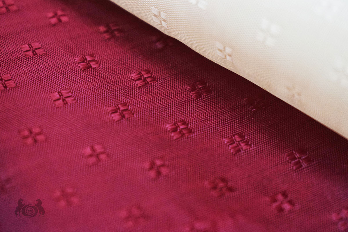
Satin has a high-sheen surface that reflects light. This makes colours appear slightly brighter and more saturated than the same colour in a matte or textured finish. A black satin lining looks rich and glossy. A blue satin lining reads as vibrant. If your outer fabric is a muted or understated tone, a satin lining can introduce more contrast than you intend, keep that in mind when matching.
- Jacquard lining
Jacquard has a woven pattern built into the fabric structure, the pattern catches and diffuses light, which softens the colour slightly compared to satin. A black jacquard lining reads as a deep, textured black rather than a high-gloss one. This is why jacquard is our top-selling lining type, it works well across a wide range of outer fabrics and colours without creating unwanted contrast. The pattern also adds visual depth that signals premium construction when your customer opens the garment.
- Taffeta lining
Taffeta has a subtle sheen and a crisp, slightly firm hand feel. Colour in taffeta reads as clean and precise, not as glossy as satin, not as textured as jacquard. It works well in garments where a defined, structured interior is needed, heavy sherwanis, achkans, ceremonial occasion wear. Taffeta’s colour tends to read close to its actual tone, what you see on the roll is close to what you get in the finished garment.
- Satin Dobby lining
Satin Dobby combines the smooth surface of satin with a subtle woven texture. Colour reads similarly to satin but with slightly less gloss, the texture breaks up the light reflection. It is a good middle option when plain satin feels too formal or shiny for the garment’s positioning.
What this means for your colour decision:
If your outer fabric is dark and structured, black brocade, navy jacquard, jacquard lining in the same family reads as premium and intentional. If your outer fabric is lighter and the garment is occasion wear, ivory silk, cream sherwani fabric, satin or satin dobby in off-white gives a clean, elegant interior. Matching lining type to garment character is as important as matching the colour itself.
Colour Matching by Garment — Sherwanis, Suits and Blazers
Here is the garment-by-garment guide our buyers use. These are not rigid rules, your production and your buyers’ preferences will shape the final call, but this is the reference that experienced manufacturers across Surat, Ludhiana and Delhi work from.
Sherwanis
The sherwani is the most colour-sensitive garment in this category. Your customer or their tailor will open it, check the interior, and form an immediate quality impression based on what they see.
- Black outer fabric — black lining is the default. Black jacquard is the premium choice. Black satin works for mid-range production. Never use a coloured lining under black, it reads as mismatched regardless of the colour chosen.
- Navy or dark blue outer fabric — navy lining is the cleanest match. Blue jacquard in a matching or slightly lighter tone works well. Some manufacturers use black lining under dark navy, this works if the interior is not prominently visible, but navy-on-navy reads better.
- Ivory, cream or off-white outer fabric — off-white lining is essential. White lining reads as too bright under warm ivory tones, the contrast is visible and makes the interior look inexpensive. Off-white matches the warmth of cream and ivory outer fabrics correctly.
- Rich colours — deep maroon, bottle green, royal blue — match the lining to the outer fabric family. A deep maroon sherwani with a black lining reads well. A bottle green sherwani with a matching green or dark lining feels intentional. Avoid using a contrasting colour here, it reads as a mistake, not a design choice, unless you are deliberately producing contrast-lined garments for a specific market.
- Gold, bronze or heavily embroidered outer fabric — black or off-white lining works best. These outer fabrics are already visually complex, a patterned or coloured lining adds noise. Keep the interior clean and simple.
Formal blazers and suit jackets
Suit lining colour convention is more standardised than sherwani — your buyers’ expectations when it comes to polyester lining in this category are more consistent.
- Black or dark charcoal suit — black lining, always. Black jacquard for premium production. Black satin for volume mid-range.
- Navy suit — navy lining or black lining. Navy-on-navy is the more finished choice. Black under navy is standard and acceptable across most production price points.
- Grey suit — black or grey lining. A mid-grey satin lining under a charcoal outer fabric reads as clean and coordinated.
- Lighter suits — beige, tan, light grey — off-white or ivory lining. Using a dark lining under a light outer fabric is visible at stress points and arm movements, avoid it.
Bandhgalas and Nehru jackets
These garments follow sherwani conventions more than suit conventions, the outer fabrics are heavier and the occasion is more formal. Match lining colour to outer fabric family, and use jacquard or taffeta for premium production. Black and navy are the most ordered colours in this category from our range.
Safari suits and Indo-Western jackets
These garments have a more relaxed formal character. Satin in black or a dark neutral works well, the interior does not need to be as visible a quality signal as it does in a sherwani or premium bandhgala. Keep it clean and functional.
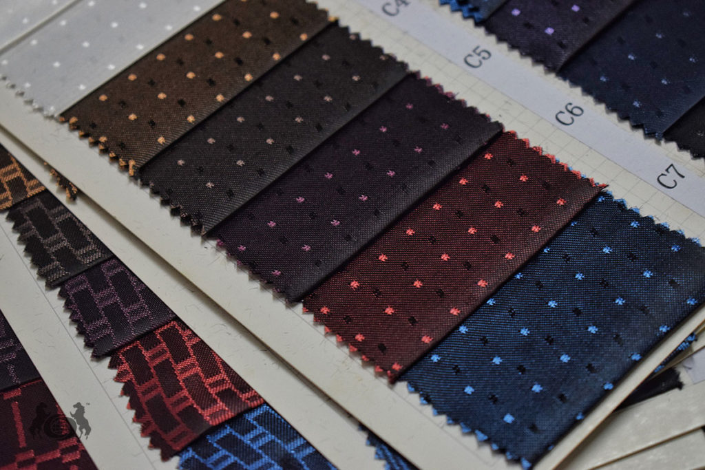
The Colours Your Production Should Always Have in Stock
Based on what our buyers order most consistently, these are the colours that cover the majority of production requirements for Indian ethnic formal wear and suit manufacturing:
- Black — your highest-volume lining colour without exception. It works across suits, blazers, sherwanis, bandhgalas, and dark occasion wear of all types. If you only maintain one colour in your stock, it is black. We supply black across all four lining types, satin, jacquard, taffeta and satin dobby.
- Blue (navy) — the second most ordered colour in our range. Navy blue lining is the standard for blue sherwanis and navy suits. It is also the most common alternative to black under dark sherwanis where the outer fabric has a blue or indigo cast.
- White — used for lighter outer fabrics, lighter formal garments, and production that includes cream or white outer fabrics. If your production runs any lighter occasion wear, white lining needs to be in your stock.
- Off-white — essential if you produce ivory, cream or warm-toned sherwanis. Off-white lining under these outer fabrics reads correctly in a way that pure white does not. It is a separate SKU from white and worth maintaining independently if you produce in this colour range.
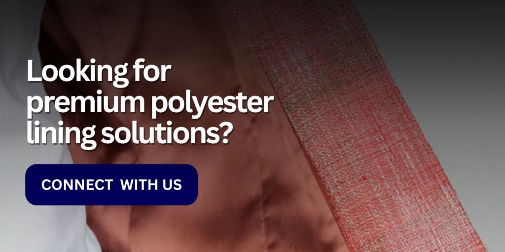
Our polyester lining fabric is available in 45-metre rolls at 55–85 GSM, MOQ 1,000 metres per SKU. Confirm colour availability for your specific lining type, satin, jacquard, taffeta or satin dobby — before placing your order, as specific colour and type combinations may have lead time implications.
Common Colour Mistakes and How to Avoid Them
These are the errors we see most frequently from production units that are switching suppliers or have not standardised their lining colour decisions:
- Using white lining under ivory or cream outer fabrics
White lining reads as too bright under warm ivory tones. The contrast is subtle but visible — particularly at the armhole and front opening where the lining edge may be partially visible in wear. Off-white is the correct choice here. It is a small change that makes a significant difference to how the garment reads internally.
- Using a lining that is lighter than the outer fabric at stress points
When your lining is significantly lighter than your outer fabric, for example, a white or off-white lining under a dark blue or charcoal outer, the lining can show through at stress points under certain lighting conditions. Always ensure your lining is at minimum the same tonal depth as your outer fabric, ideally slightly darker.
- Mismatching lining type to garment price point
Using plain satin lining in a premium sherwani that the customer is buying at a high price sends a mixed message. The outer fabric signals quality, the interior signals cost-cutting. For your premium production, jacquard lining is the correct choice, the woven pattern signals craftsmanship that plain satin cannot. Reserve satin for your volume and mid-range production where the interior signal is a lower priority.
- Not checking colour consistency across batches
If your production runs over multiple batches, particularly for a single garment line or collection, you need colour consistency across every roll. A navy lining from one batch that is slightly lighter or greener than the previous batch will create visible inconsistency across garments in the same collection. When you order from us, confirm that the colour you are ordering is in consistent stock across the quantity you need, and request a sample from the current batch if you are continuing a production run.
- Not holding lining sample against outer fabric in natural light
Colour decisions made under factory lighting or fluorescent light can look very different under natural light or the retail lighting your customer’s store uses. Always hold your lining sample against your outer fabric in natural light before confirming your colour selection for a production run.
Building Your Colour Stock Before the Next Season
We supply polyester lining across all four types, satin, jacquard, taffeta and satin dobby, in bulk to garment manufacturers and production houses across India. Our range covers 55–85 GSM in 45-metre rolls. The top-selling colours in our range, black, blue, white and off-white, are consistently stocked across our most popular lining types.
Here is what to confirm when you place your lining order with us:
- Lining type — satin, jacquard, taffeta or satin dobby
- Colour — black, blue, white, off-white or other colour from our available range
- GSM — 55–85 GSM depending on your outer fabric weight
- Quantity — MOQ is 1,000 metres per SKU
- Lead time — confirm availability before wedding season, when demand for jacquard lining for sherwanis spikes across Surat, Ludhiana and Delhi
If you are unsure which colour or lining type works best for a specific garment in your current production, reach out to us with your outer fabric details. We will give you a clear recommendation before you commit to a bulk order.
For manufacturers producing across multiple garment categories, sherwanis alongside suits and blazers, we recommend maintaining at minimum black, navy and off-white across your two most-used lining types. That combination covers the majority of production scenarios you will encounter in Indian ethnic formal wear and suit manufacturing without overstocking.
Link of related Articles
- Lightweight Interlining vs. Heavyweight Interlining
- A Beginner’s Guide to Interlining
- Choosing the Right Interlining